Anacafé / Guaco Café — 2025
Primacafé
A commemorative cup made for specialty coffee.
Product Design
- Client
- Anacafé / Guaco Café
- Year
- 2025
- Type
- Product Design / Ceramic
- Role
- Product Design
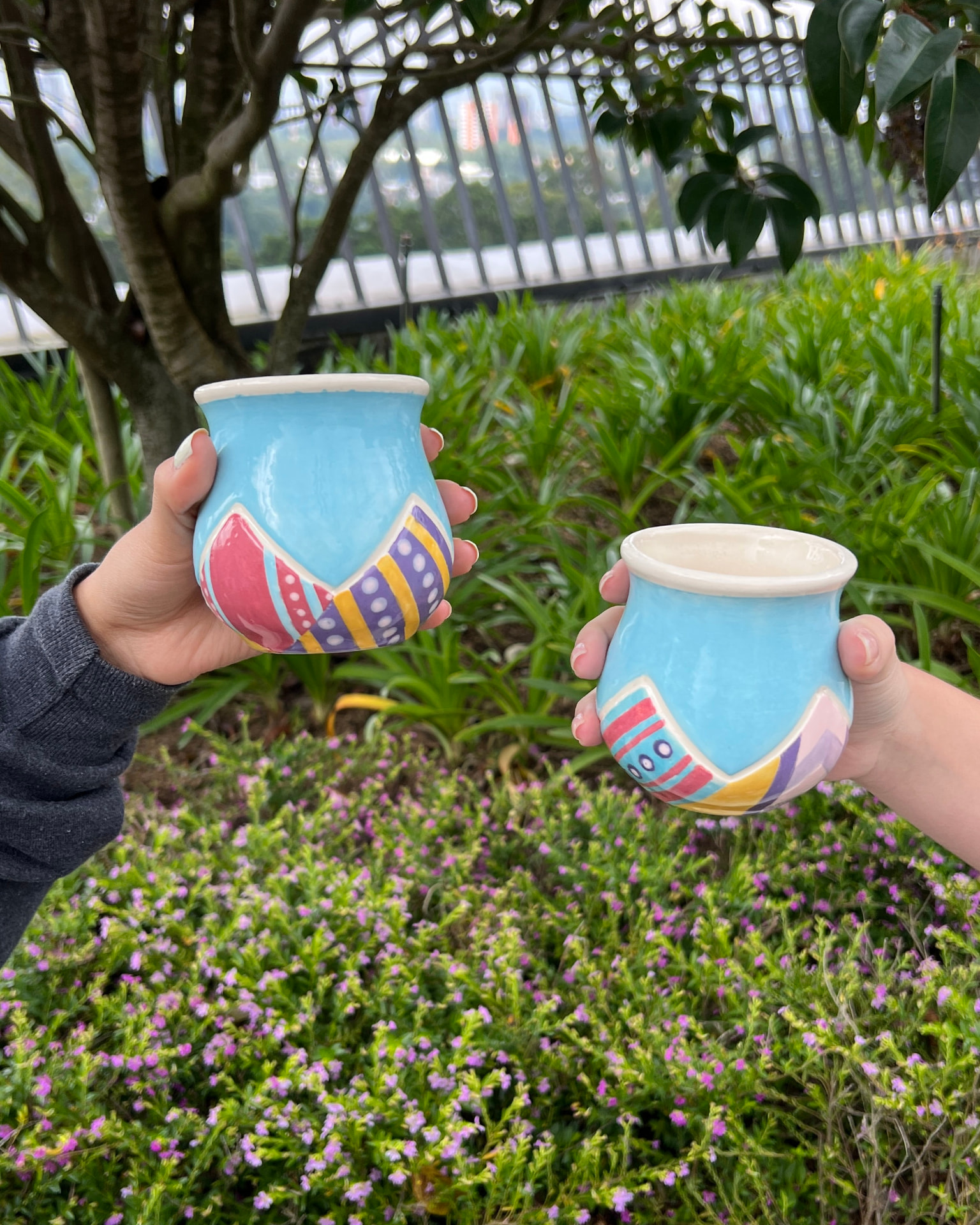
A cup that had to mean something.
The brief was to design a commemorative cup that celebrated Guatemalan tradition and could become a collectible object.
But this was not just about making something look representative of Guatemala.
The cup also had to work for specialty coffee.
That meant the form had to respond to how coffee is actually experienced, not just how the product looked.
The challenge was to bring together culture, function and a familiar everyday object without making the result feel predictable.
How do you put Guatemala in a cup?
We started by looking at what already exists.
Anacafé introduced us to cup forms used for specialty coffee, including the Pinot shape, designed to help highlight the aromas and nuances of the coffee.
That gave us a functional starting point.
The next question was more difficult:
How do you make a cup feel unmistakably Guatemalan without simply decorating it with symbols?
The answer came from two things that continuously shape the country:
landscape and textile.
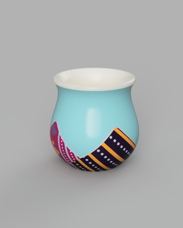
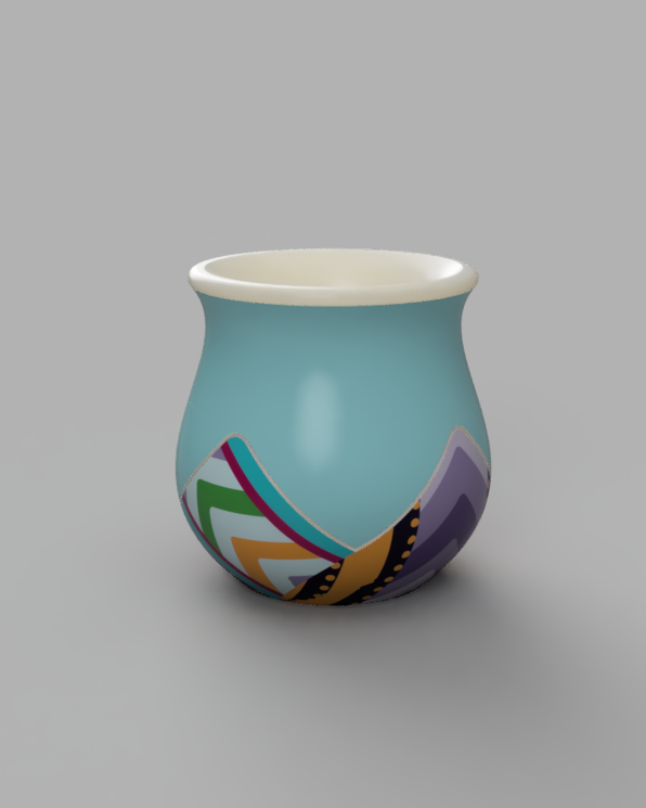
The mountains and volcanoes of Guatemala became the main form of the cup.
Inside them, we introduced textile-inspired textures as a quieter reference to the country's craft traditions.
The goal was not to put Guatemala on the cup.
It was to build Guatemala into it.
Designing something people already know.
A cup is a product people already understand.
That makes it surprisingly difficult to redesign.
We explored existing specialty coffee forms first, looking for a structure that already worked ergonomically and functionally.
From there, the project became less about reinventing the cup itself and more about asking how much could be changed without losing what already worked.
The chosen Pinot form became our base.
Then the landscape became the intervention.
The mountains had to change.
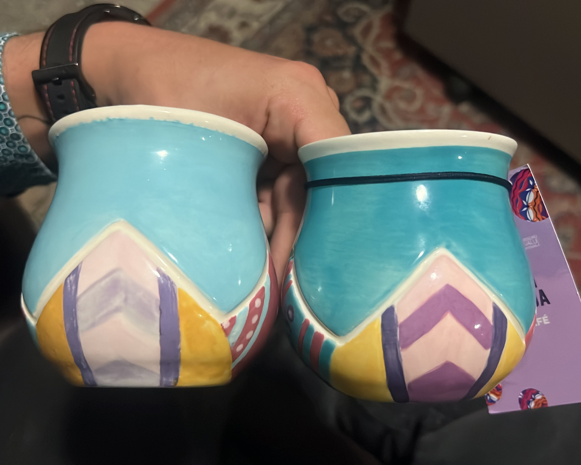
The first version pushed the mountain relief above the main body of the cup.
Visually, it worked.
In practice, it didn't.
The additional ceramic created concerns around ergonomics, how the cup felt in the hand, and the amount of material concentrated in the relief.
So the mountains had to come down.
Instead of keeping them raised above the body, we brought the relief level back to the cup itself.
Then we asked:
What else could that line do?
That became the drip catcher.
A change that started as a constraint became another functional detail of the product.
There was something at the bottom.
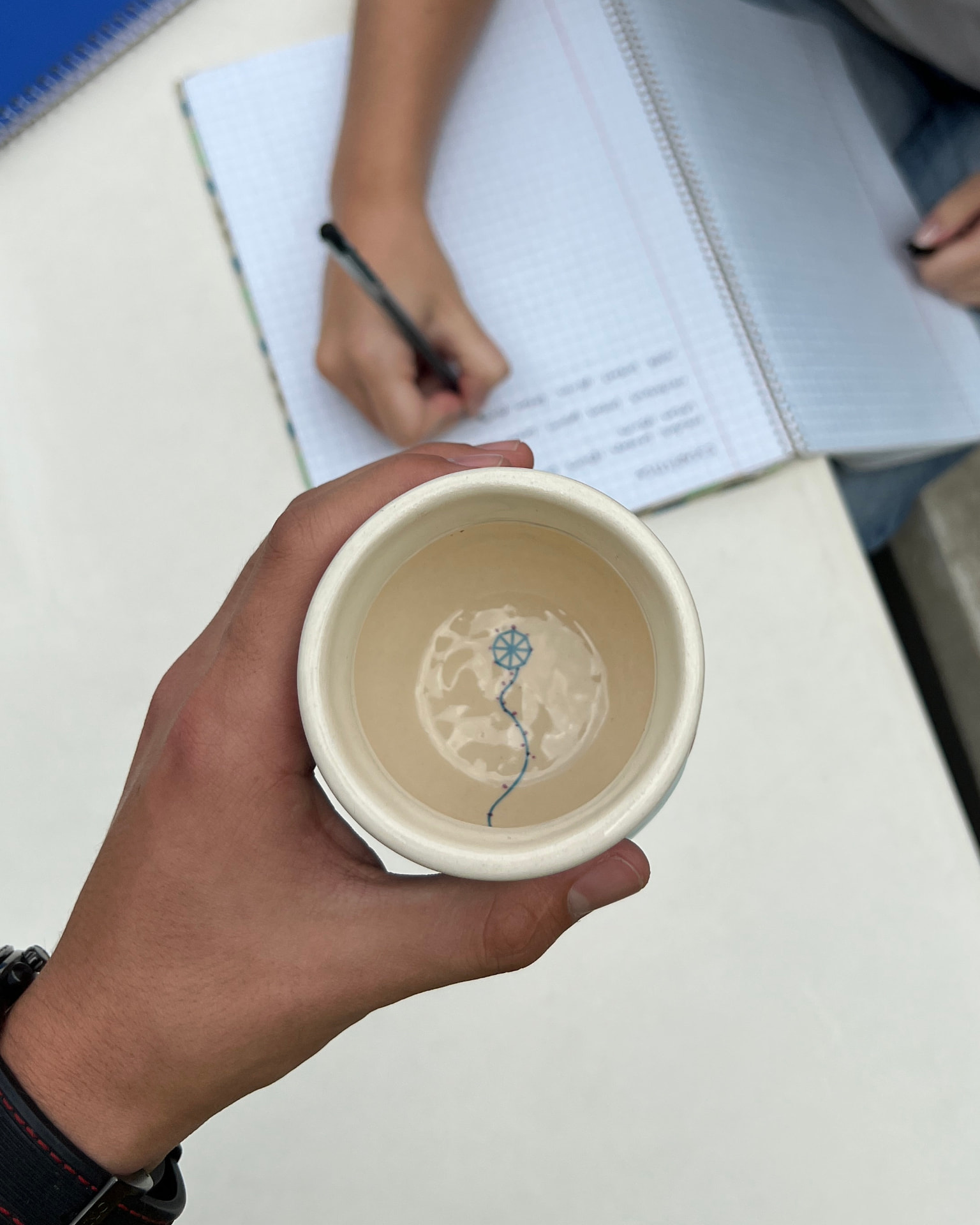
We wanted to hide one more detail inside the cup.
A Guatemalan kite.
The idea was that its tail would travel along the inside of the cup and end at the top edge.
You would only discover the full illustration once you finished your coffee.
It was a small interaction designed to reward you for getting to the bottom.
For the final production version, that detail was replaced by the Guaco Café logo.
Making ceramic real.
This was our first time developing a ceramic product with an external maker.
We had to learn how ceramic molds and production actually work, including an important detail: the master model needs to be produced larger than the final piece because the clay shrinks during firing.
We created the first printed prototype and worked with the ceramic supplier to translate it into the final piece.
Once the cup reached the bisque stage, we went to the workshop and painted the textile texture by hand.
The colors were deliberately softer at this stage.
After firing, they became much more intense.
The final finish revealed another part of the process that is easy to miss when designing only on screen:
Materials change their mind.
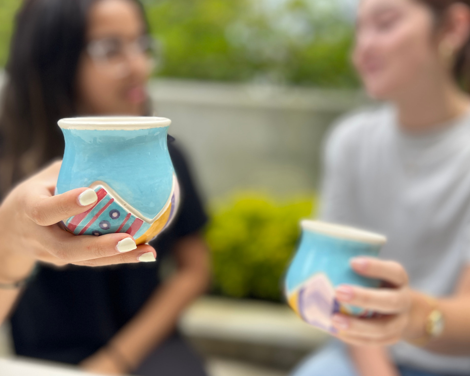
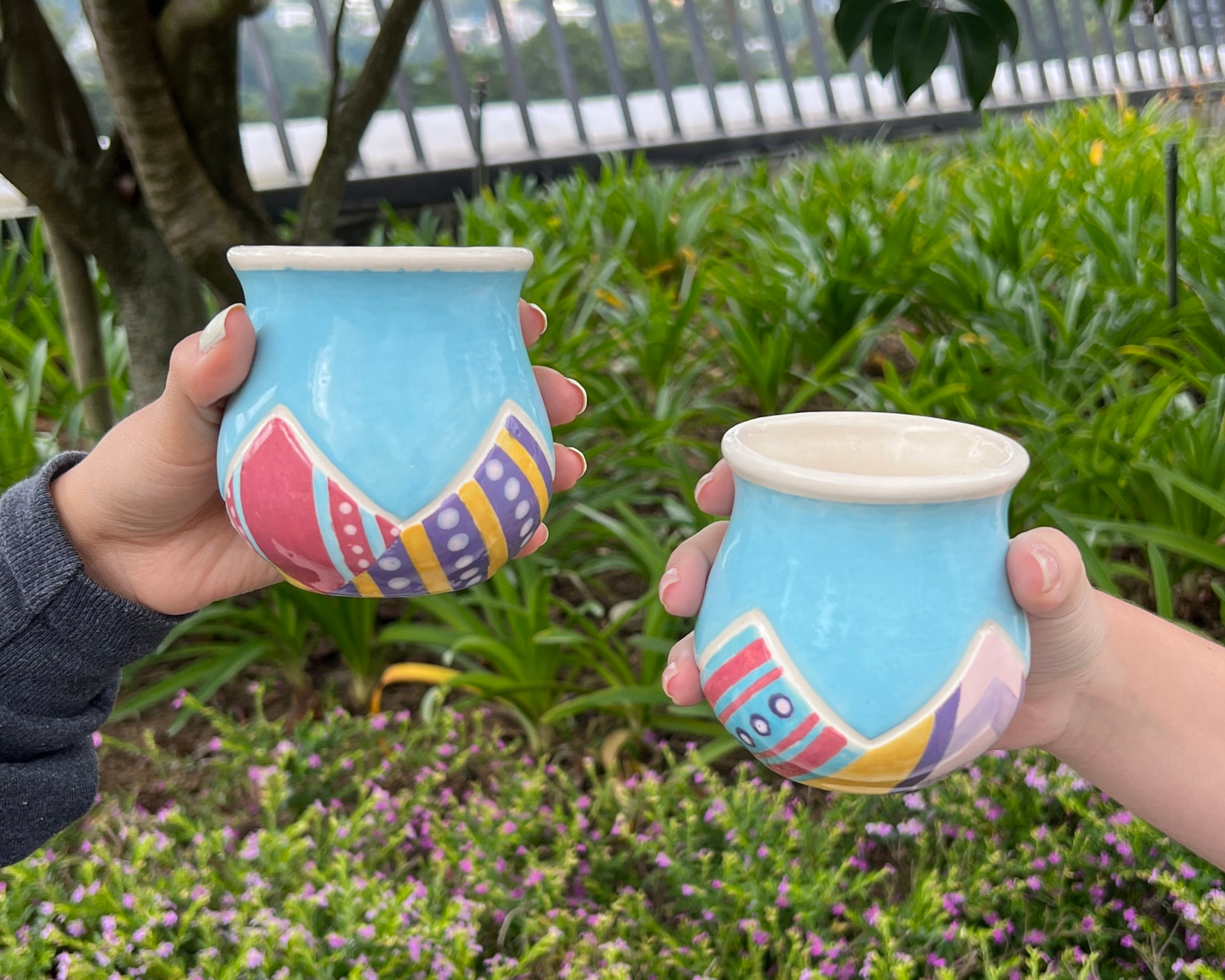
The prototype wasn’t the product.
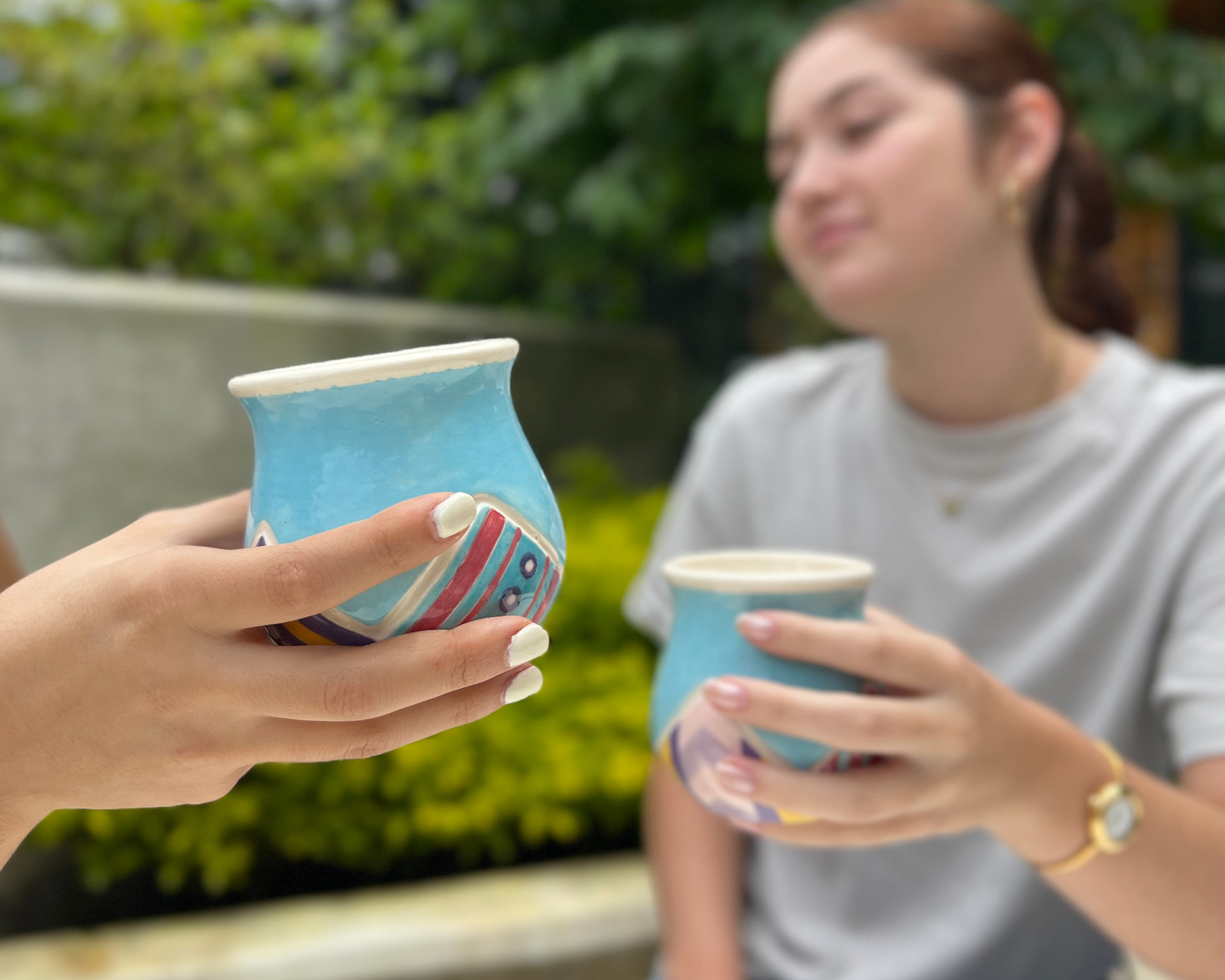
The final production piece was not identical to the prototype.
Some details changed.
The kite became the Guaco Café logo.
The mountain relief was adjusted.
The colors became more intense after firing.
And the parts of the process we thought would be straightforward — including painting the textile texture by hand — turned out to demand much more attention than expected.
The prototype told us what the idea could be.
Production told us what the idea needed to become.
It didn’t win.
Still…
It got made.
70 pieces.
The design was later selected by Anacafé / Guaco Café for a real limited production run of 70 pieces.
The cups were individually numbered and sold to the public through Guaco Café.
What had started as an academic design proposal became a real object people could actually buy, take home and use.
The project was also launched at the café, where we were invited to present the story behind the design.
From prototype to shelf.
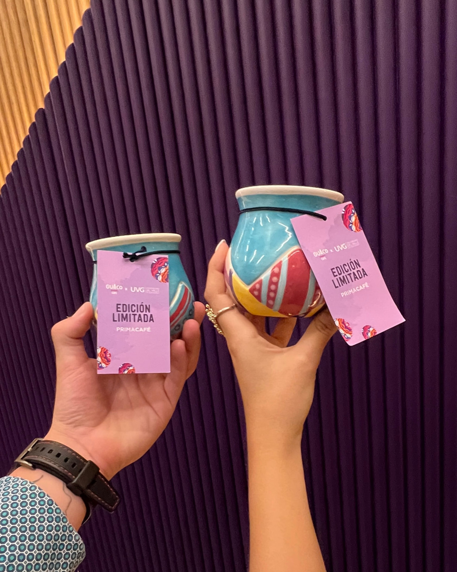
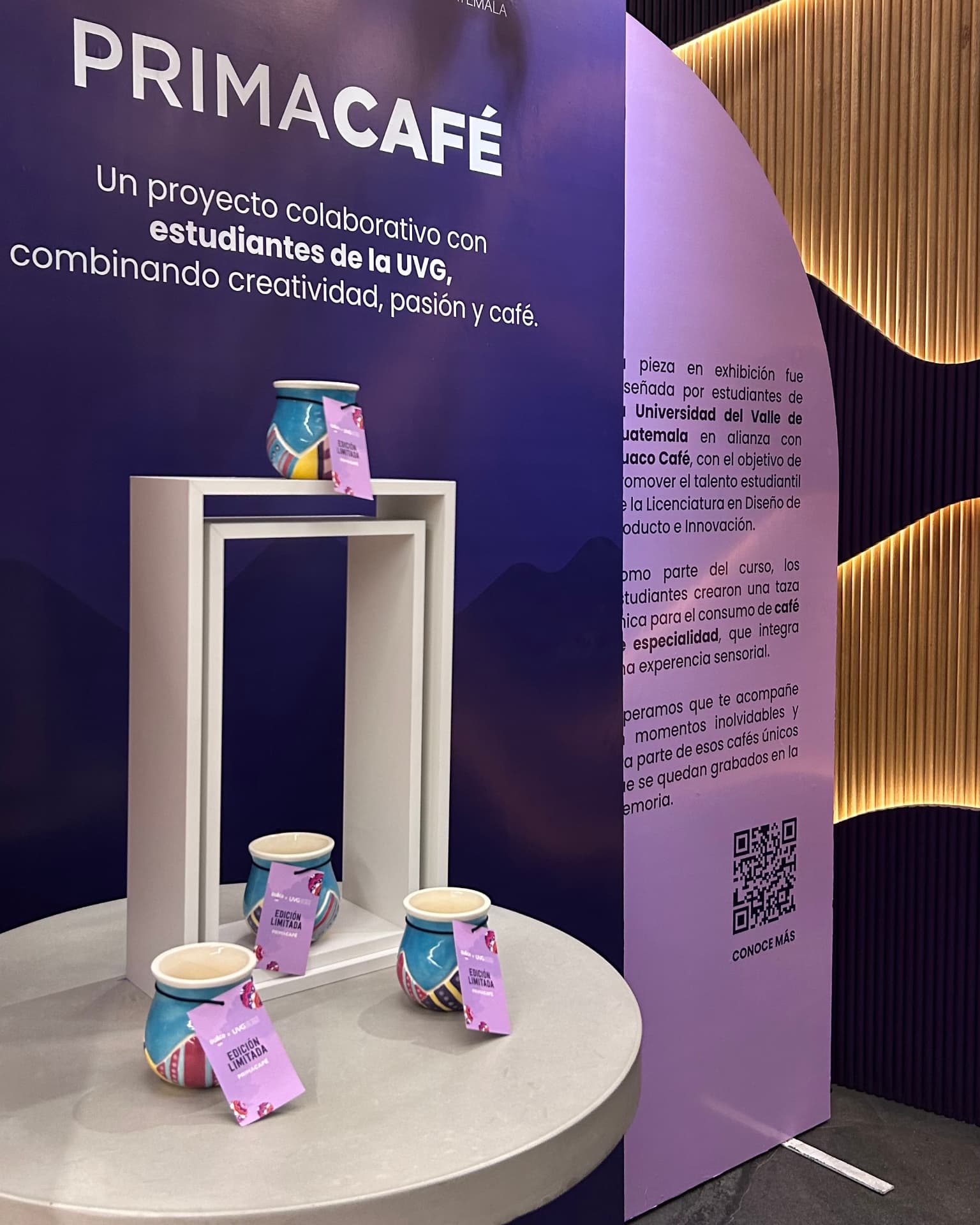
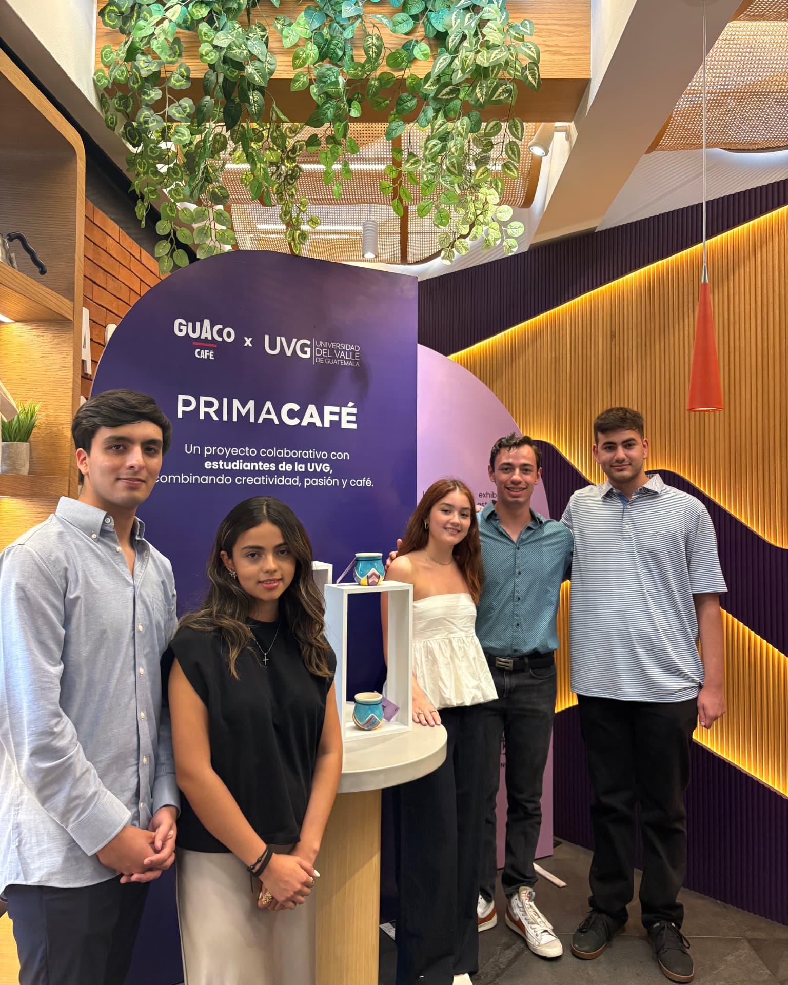
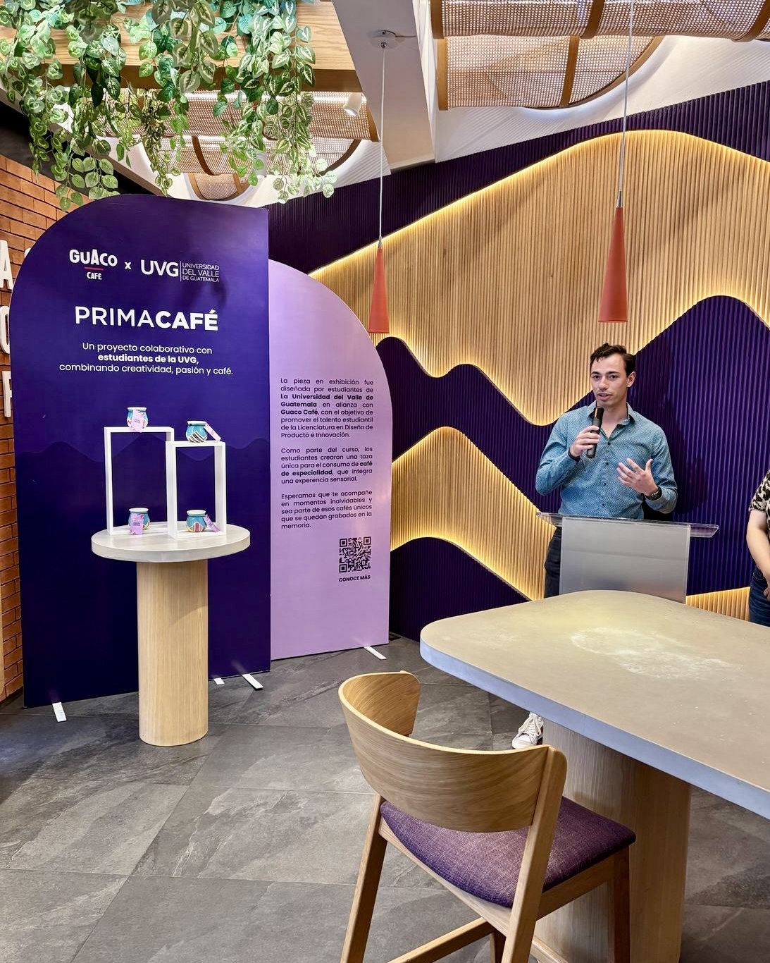
70-piece limited edition produced and sold through Guaco Café.
What stayed with me.
This project taught me that designing for production means knowing when to hold onto an idea and when to adapt it.
A prototype can look exactly the way you imagined.
A real material won't always cooperate.
A production run introduces constraints you cannot see on screen.
And sometimes the better design is the version that changes.
The most important part was seeing the project leave the classroom and become something real.
Not just something that could be presented.
Something that could actually be made, sold and used.