Monster Energy — 2025
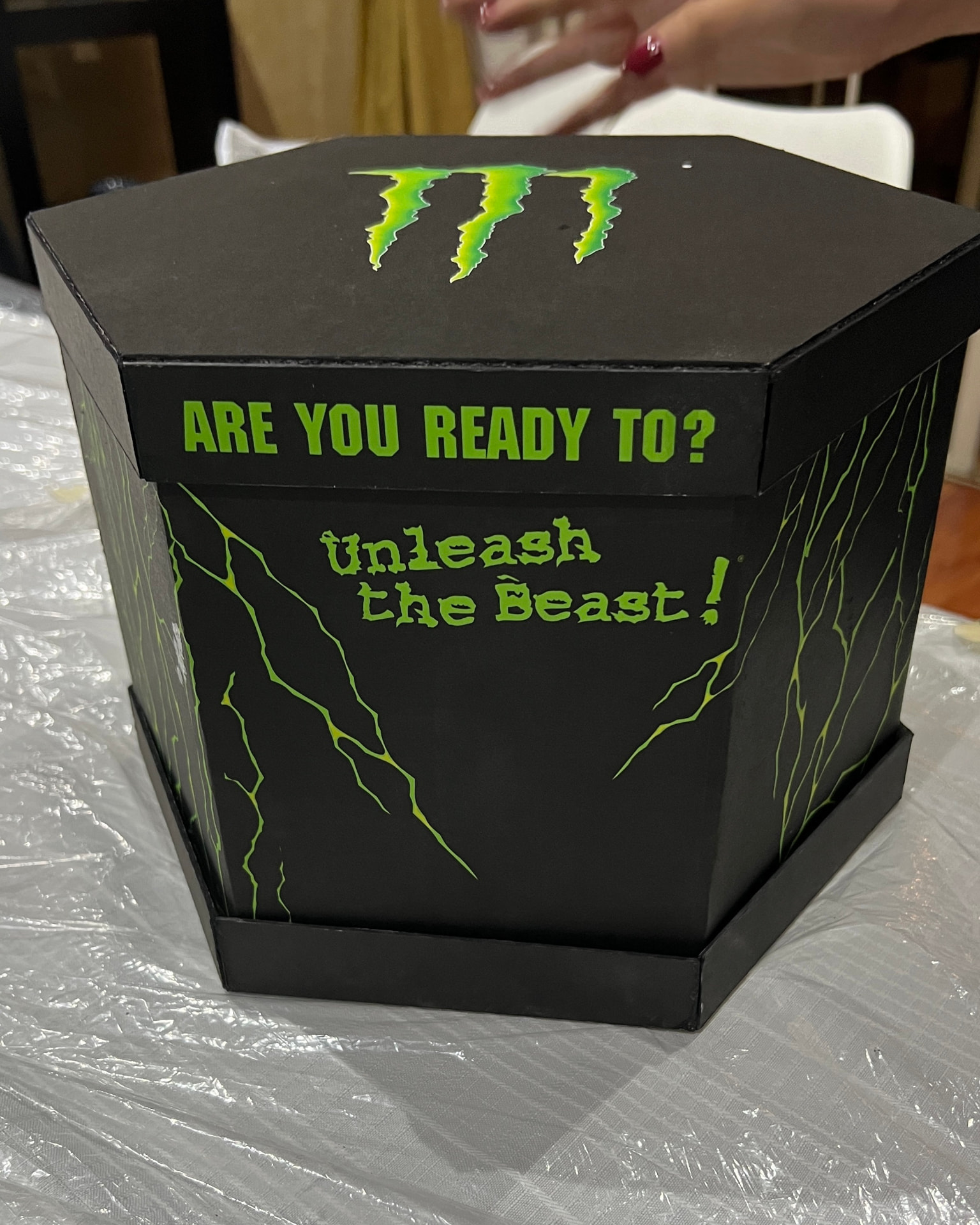
Monster Energy PR Box
A PR box that didn't end with the unboxing.
Product Design
- Client
- Monster Energy
- Year
- 2025
- Type
- Product / Packaging / Experience
- Role
- Product Design
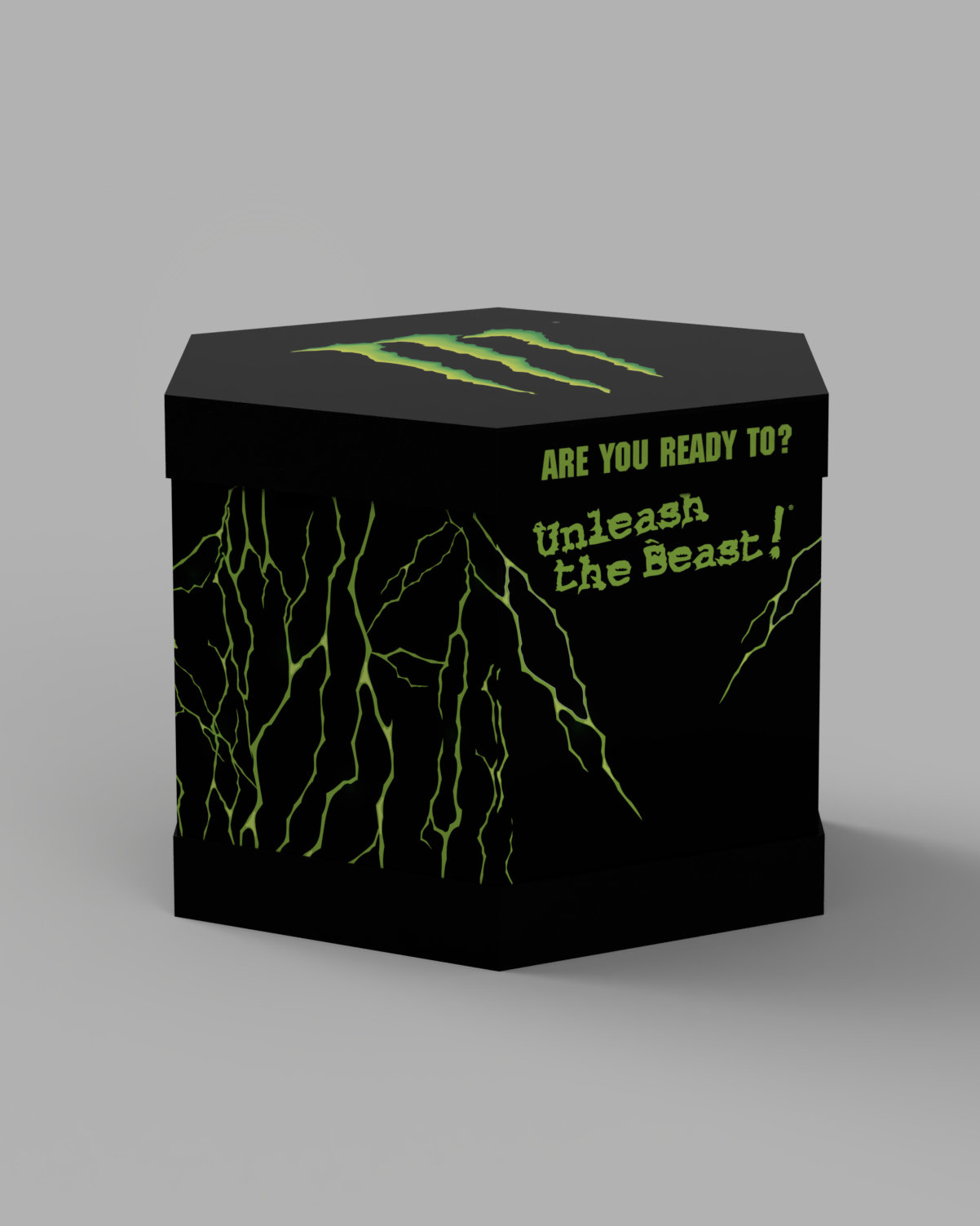
What happens after the unboxing?
The brief was to create a PR box that could be sent to influencers across Monster Energy's different brand worlds, while including all five available flavors and a souvenir for the recipient.
The goal was not simply to package the products.
It was to create something worth remembering.
The box wasn’t the end.
During research, we noticed a type of user that often gets overlooked:
The collector.
Monster has an unusually large variety of cans, collaborations and editions, which creates a natural collecting culture around the product.
That led to a different question:
What if the PR box became part of the collection?
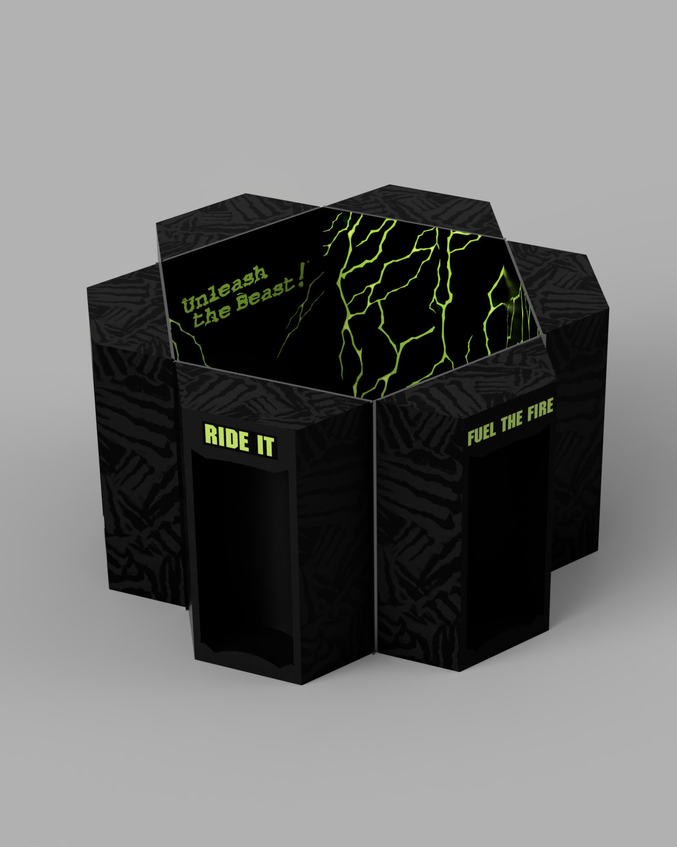
Instead of ending with the unboxing, the structure could be turned around and reused as a display.
The same spaces that held the cans during transport could later hold new cans, existing collections or favorite editions.
The package became something that could stay.
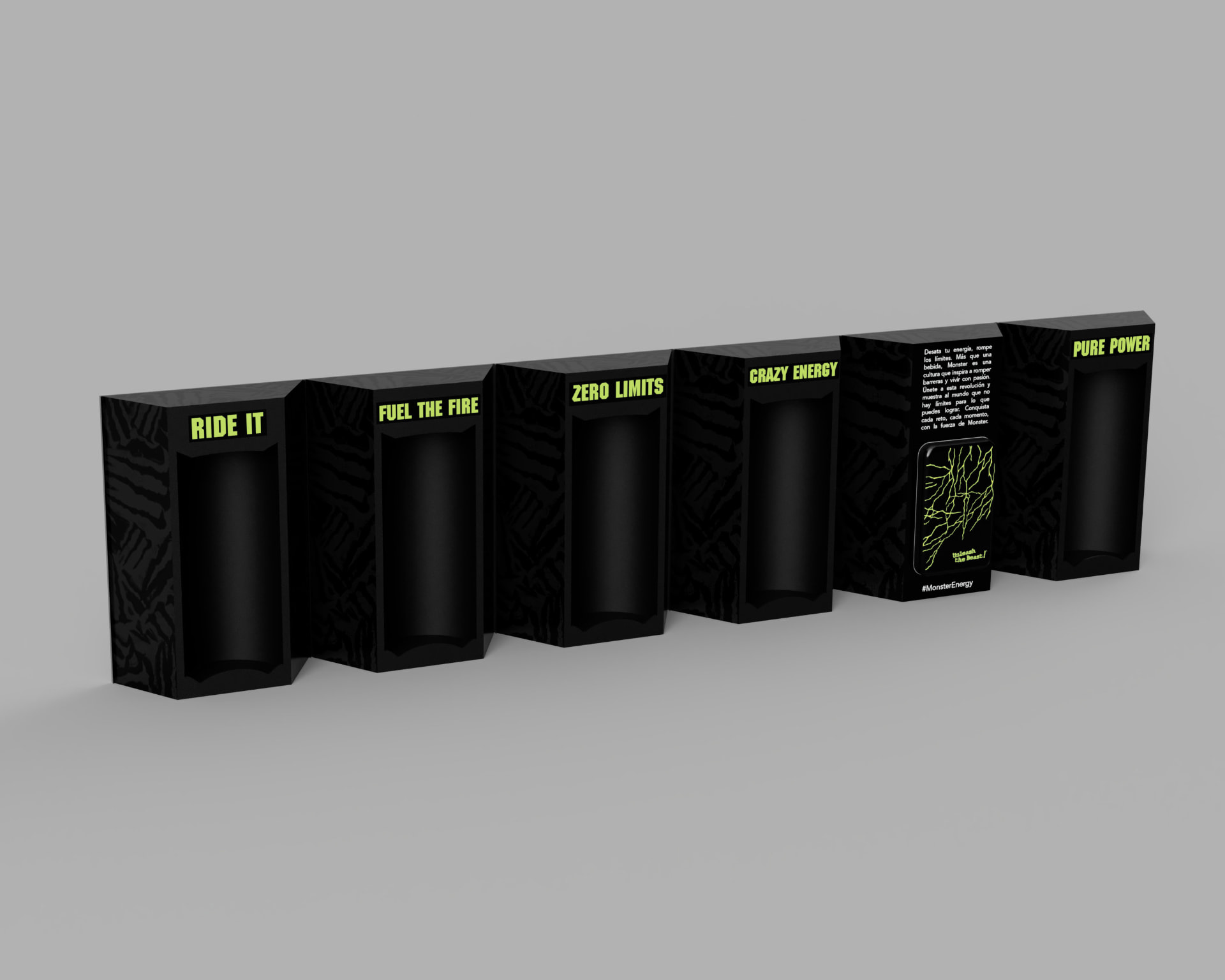
One hexagon. Five modules.
The hexagonal form was not just a visual decision.
The structure had to be divided into modules that could assemble into the final shape while also solving several practical problems:
How should the modules connect?
How could each can remain secure during transport?
How could the cans still be removed easily once the box arrived?
And how could the whole structure open and transform into a display?
A simple shape can hide a complicated system.
The prototype fought back.
The first idea looked simple on screen.
The prototype wasn't.
We had to work through the actual construction of the hexagon, the movement of the modules, the way the cans would stay secure during transport and how the user could still remove them easily.
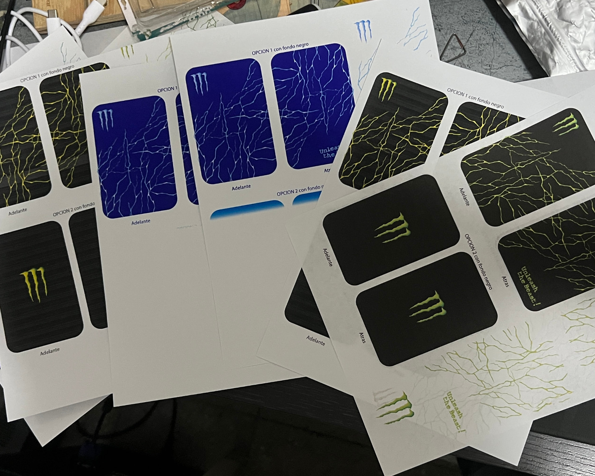
The printed graphics created another problem.
Some of the stickers and paper elements could not handle the movement of the structure and began peeling or tearing.
Even the power bank label needed several iterations before it fit correctly.
The prototype forced us to design not just the shape, but the behavior around it.
The shape was simple. The behavior wasn't.
What stayed with me.
A simple form can hide a complicated interaction.
The biggest problems do not always appear while designing the object.
Sometimes they appear when someone actually has to open it, move it, use it or transport it.
This project reminded me to stop designing only the shape and start designing the behavior around it.